Design Observations
-
Adaptive notification timing
New users need time to read alerts. Experienced users want them gone quickly.
Track how long someone has used your product. Show alerts longer for newcomers, shorter for veterans.
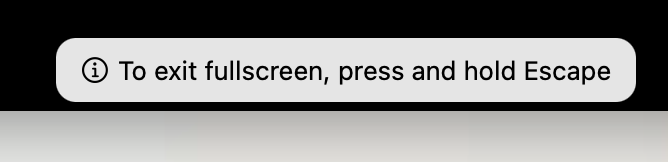
A browser’s “press escape to exit fullscreen” alert works perfectly here. New users see it for 3 seconds. They need time to read and understand. As they learn your product, cut it to 2 seconds, then 1 second.
This respects user expertise while keeping helpful guidance.
-
User delight via micro animations
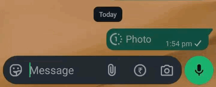
WhatsApp’s “view once” messages show craftsmanship in a tiny detail.
Send a view-once photo. After someone views it, try tapping it three times. WhatsApp shows a fading “shush” emoji floating upward.
This path barely gets used. Most people tap once, see nothing, and move on. But WhatsApp still polished this micro-interaction.
Instead of showing an error popup saying “you can only view this once,” they use a playful animation. The shush emoji communicates the same message: this was meant to be seen once.
That’s craftsmanship. Delighting users even in the smallest, least-traveled corners of your product.